AdventureMaker
For my final semester of Junior year at Purdue, I set out to complete my individual Capstone project. I chose to focus on travel, creating a website where users can browse preplanned group trips, meet others to travel with, or message group members once the trip has been booked. This all-encompassing website will provide would-be travelers with security in knowing that they will have a good time with the group of strangers they are traveling with and alleviate stress when finding the perfect trip for their personality and preferences.
For an in-depth review of this project in its entirety, check out my Final Documentation. For this portfolio, I will be showcasing my specialization (UI / Visual Design) growth throughout this project.
Design Process
For this project, I had 1 major user group, as well as a secondary user group that I could explore further once the project has developed. These included:


Primary Users
Secondary Users
Adventurous young adults aged 18-35 who are interested in traveling.
Friend groups who want an easy way to book a trip together.
My final deliverables for this class and my own personal development included:

High-Fidelity Interactive Prototype
Design Documentation

Milestone 1
Understand project scope and identify priority features
Goal: Research and analyze competitors to ideate based on current similar solutions. Understand user needs and narrow scope.
Activities
Milestone Outcomes
-
Preliminary sketches backed by research into the current market and user input.
-
Narrowing of key features: Trip Search, Preference Profile, Friend Finder, and Logistics & Information.
Literature Review
I first wanted to do some background research on my topic to understand more the role of social relationship building on trips, safety concerns with meeting travel companions through the app, how existing friendship apps work, and what makes people chose preplanned trips to travel.
This research allowed me to gain some understanding of my topic, learn how to resolve any potential safety or legal issues, and ideate potential features for my website.
Findings
-
Background checking upon sign up is necessary in order to prevent assault or other potentially dangerous situations. Users would not be able to see other profiles until the background check was complete.
-
Connection with others is a major goal of travel, especially for those traveling solo.
-
Emphasize trips based on demographic as well as personality.
-
Keeping prices low and transparent will encourage more users to book trips, even if they do not 100% meet their needs.
This information helped me a lot to narrow my idea and understand safety that goes into messaging and later meeting up with people from an app, as well as what people are looking for in a trip and how best to provide this experience for them.
Competitive Analysis
I then looked at 4 different companies with varying similarities to the features I wished to include in my prototype to understand the current process a bit more, see what worked well, what could be improved, and what I could combine from different systems to make the best overall experience for users.

After organizing my findings in a table, I then sorted all of these results into categories based on the feature rather than the company.
Findings
-
Several categories emerged including design opportunities, pain points, personal safety, and demographics, to further refine my idea.
-
Several elements persisted across multiple platforms that I should make sure to include in the prototype.
-
Multiple companies tackled safety well/gave me ideas to how I can make improvements for personal security.
-
A few pain points were highlighted that I can avoid in my designs.
This process taught me to combine research methods (competitive analysis and affinity diagramming) to consolidate my thinking. Using the affinity diagram, I was able to organize my insights into actionable data that I could then use to inform my design and ideate features.

To view this table and my insights in more detail, see my documentation, linked at the top of this page.
Sketching
After concluding this activity, I was then able to conduct initial interviews with participants in my user group, gauging their current travel experience and what they would look for in a website like my idea. I then took these insights and created sketches for all features in the platform.
Based on my research, I decided that my app should be split up into the following main pages:
-
Homepage
-
Trip Search
-
Find Friends
-
Profile
-
More Information
I then made sketches for each of these pages to further visualize where all of the content would be located on each page.
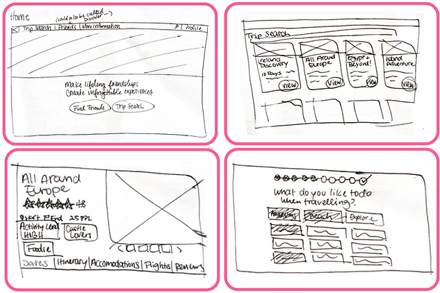
From these sketches, I was then able to start on the prototyping process, translating these paper sketches into figma with proper formatting and layout to then test with more users.
Milestone 2
Ideate a solution based on user needs
Goal: Build upon background knowledge and create working testable prototypes for further iteration.
Activities
Milestone Outcomes
-
Actionable insights from testing to use to ideate mid-fidelity screens.
-
Use of auto-layout in figma to make a sophisticated, easily editable prototype for iteration.
Low-Fi Prototyping
After mapping out the flow of the website in a site map, I translated my sketches into a low-fidelity prototype using figma. My challenge in this was to ideate everything in proper frames, padding, and auto-layout structures for easy iteration in the future. This process took a long time, but helped a lot when making changes and got me in the habit of creating successful designs for coding translation and development.
Homepage
Trip Search

Includes:
-
Page sections to explain company mission and features.
-
Provides hyperlinks to site pages for easy navigation.
-
Answers questions new users may have who are hesitant about the service.
Includes:
-
Main trip search page to browse different trip options.
-
Filter and sort options to narrow search.
-
Detailed trip cards displaying necessary information of each trip.
-
-
Trip specific page including all information, trip tags, itinerary, booking, accommodations, and all other information relevant to the trip.

Profile
Find Friends
Includes:
-
Profile to view messages, connections, and edit all personal information.
-
Questionnaire to fill out profile sections and make it easy for users to match to each other based on their answers.
Includes:
-
Main find friends page with profiles of users sorted by compatibility.
-
Consistent design to trip page.
-
-
User specific page where users can view a specific person's profile and connect with them.
-
Consistent design to profile page.
-
This process helped me to not just create an initial flow of the user's experience with the website, but also allowed me to hone my skills in auto-layout on figma, leading to a cohesive and clean design on my first iteration.
Concept Testing
I then used the fully interactive low-fidelity prototype to test with individuals in my user group. My goal was to gauge the usefulness of the features and get feedback on pain points, advantages, and additional suggestions they may have for the interface.
Outcomes
Overall I received a lot of great feedback and a ton of suggestions for what could be improved in the prototype, and I was able to address and implement every one. This process allowed me to collaborate with other people for the first time in this solo-project and helped me see problems from another perspective.
One big change that I implemented was that 4 content cards of information may be overwhelming for users, especially since there are so many trip options and friend profiles. I was able to reduce cognitive load by lowering the number of cards per line to 3, allowing for information to be much more visible.

Milestone 3
Iterate solution and synthesize brand identity
Goal: Establish branding and create a finalized cohesive solution. Further iterate on prototype and gain feedback from testing for future recommendations.
Activities
Milestone Outcomes
-
Comprehensive component library and branding for easy implementation.
-
Finalized high-fidelity prototype iterated on with participant feedback.
Mid-Fi Prototyping & Usability Testing
In these activities, I simply implemented all of the suggestions obtained in my concept testing and added some color and images to the prototype, increasing it to a higher fidelity. I then tested on this prototype with 2 returning participants and 2 new participants. I walked my participants through tasks to complete in the prototype and gauged the effectiveness of the user experience.
Findings
-
Interface was clean and concise while also still providing detailed information.
-
Users were able to navigate the website successfully without major issues.
-
A few issues were highlighted that I was then able to fix and implement.
-
I also got feedback from my TA to make sure that the hero section on the homepage clearly describes what AdventureMaker offers and how they are different. This was something that the current section was having trouble with, so I was sure to keep this in mind going into high-fidelity prototyping.

Brand Kit / Style Guide
Before iterating again to create the final interface, I wanted to create a brand identity and component library to base my designs on. This was a challenge for me, since I had never used assets and component libraries in figma, so learning how to make one gave me a new depth of understanding of the service. Isolating all of my components, colors, and buttons to one file, I was able to easily make changes to the entire website and maintained consistency throughout the platform.


Using this component library, I was able to effectively create my final high-fidelity prototype. With this library in place, I can easily go back and change the styles and colors of components without having to manually replace everything across multiple files. This will further help if I chose to explore this project further and conduct future design iterations.
Final Prototype
My final prototype consists of the Homepage, Trip Search pages, Find Friends pages, and Profile pages. For the high-fidelity interactive prototype, I made the website as close as possible to how it would look and feel when made into a functioning website. Check out the complete prototype below and make sure to click through all of the interaction points! To view more of my progression from Low / Mid / High Fidelity, check out the different flows all available on the prototype mode as well. Make sure to go into full screen on the prototype for the best experience.